Damit ein Polarlicht-Gemälde wirkt, als würde es sich bewegen, malen Sie zuerst den dunklen Himmel und den Vordergrund und verblenden dann jedes grüne Band mit senkrechten Strichen nach oben, sodass sein oberer Rand ohne sichtbare Linie im Dunkel verschwindet. Eine typische Polarlicht-Leinwand hat 24 bis 32 Farben und gilt als Projekt für Fortgeschrittene.
Aurora-Sets täuschen. Aus der Schachtel sehen sie einfach aus, große weiche Grünbänder über dunklem Himmel, keine kniffligen Details. Malst du sie dann flach, sieht es wie ein grüner Zaun aus. Das Licht eines echten Polarlichts hat keine obere Kante. Es verblasst einfach ins Dunkel, und genau dieses Verblassen zu malen ist der ganze Trick.
Lies die Bänder, bevor du anfängst
Eine Nordlicht-Leinwand trägt meist 24 bis 32 Farben, viel Grün und Türkis, mit Lila und Rosé, das an den Rändern hereinkriecht, dazu einen Stapel dunkler Blautöne für den Himmel. Bevor du den Pinsel ansetzt, schau dir an, wo die Lichtbänder am Horizont liegen, oft ein See, eine Baumlinie oder Schnee. Dieser Vordergrund ist dein dunkler Anker. Der Himmel ganz oben ist ebenfalls dunkel. Das Licht lebt in der Mitte und muss in beide Richtungen verschmelzen.
Willst du das selbst malen?
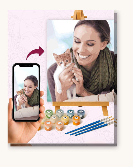
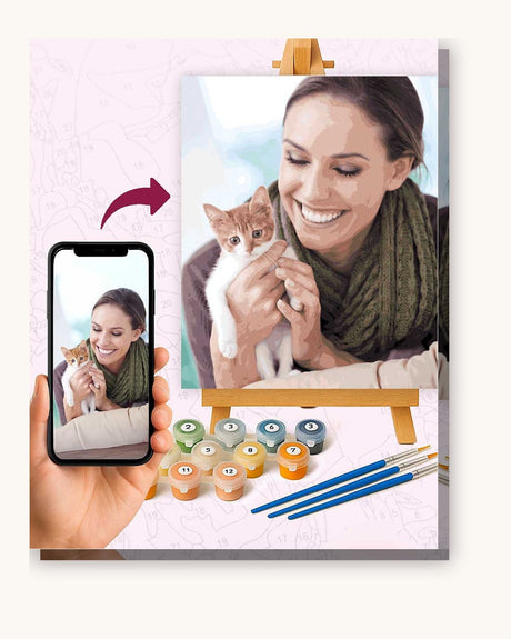
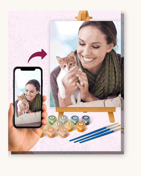
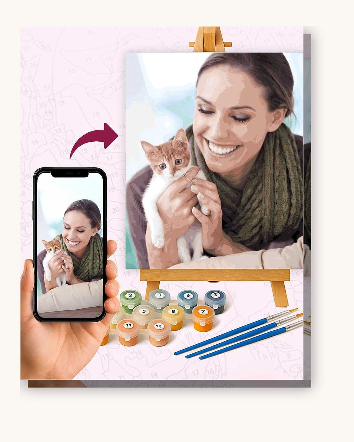
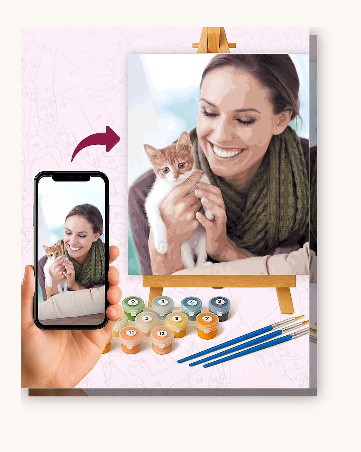
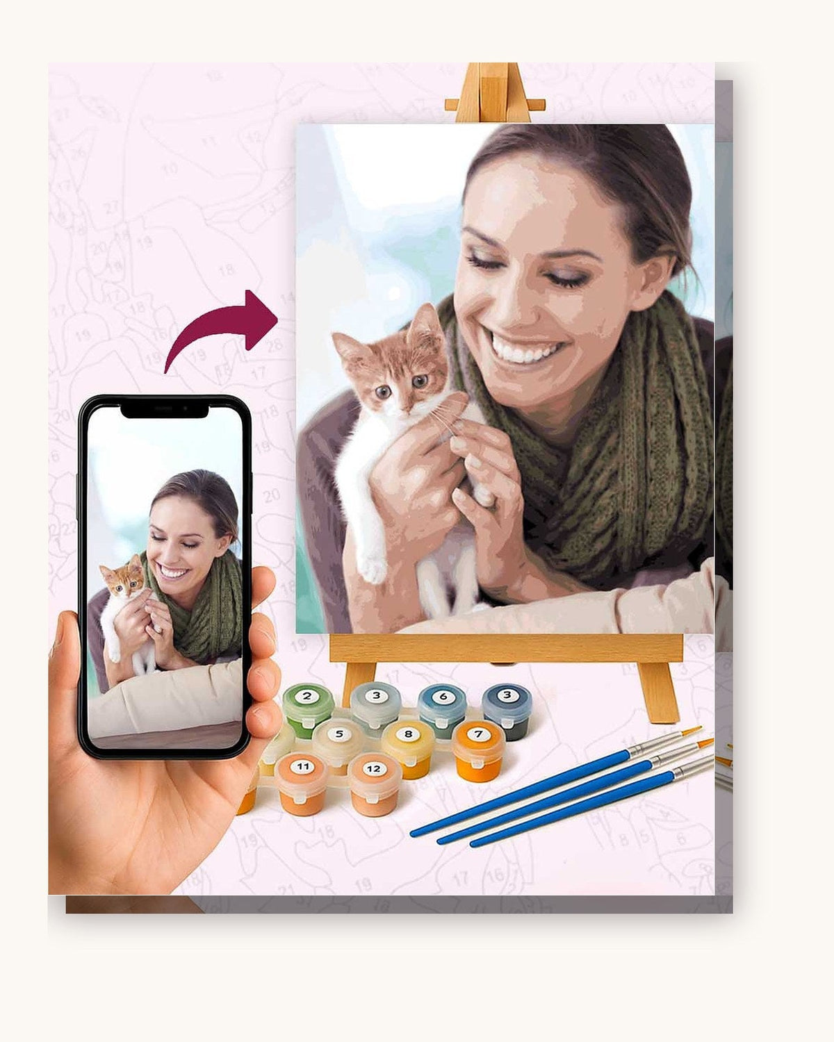
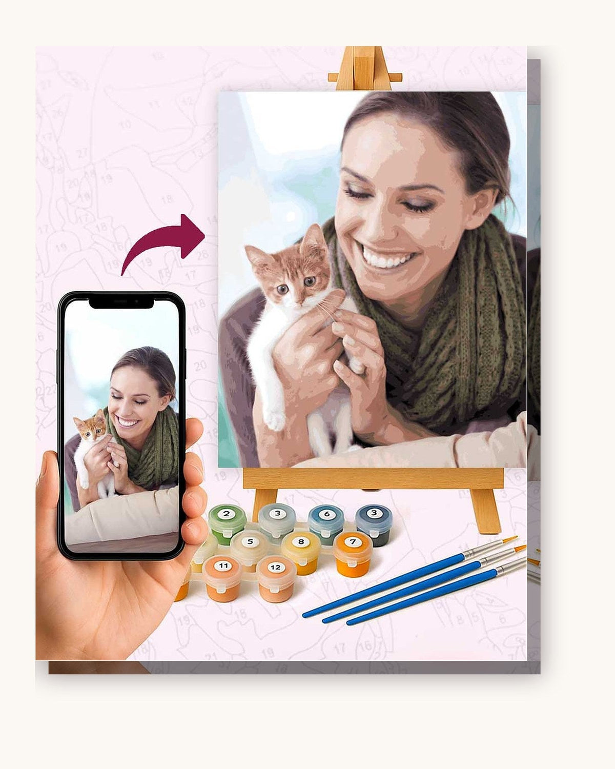
Verwandle eines deiner Fotos in eine nummerierte Leinwand (ab $19.95). Wir zeichnen sie nach, mischen die Farben passend dazu und schicken das Set mit Pinseln.
Oder nimm ein fertiges Motiv:
- Aurora Reflections Malen-nach-Zahlen-Set (ab $19.95)
- Nocturne Bistro-Lichter - Malen nach Zahlen (ab $19.95)
- Perpetual Look Malen-nach-Zahlen-Premium-Set (ab $19.95)
Blend up, not across
Here's the part the numbers won't tell you. Aurora ribbons are painted with vertical strokes, brushing upward, and they get lighter toward the base and fainter toward the top. Fill your green section, then take a small round brush with barely any paint and drag the top edge upward into the dark sky until it disappears. No line. That vanishing top edge is what sells the movement. Do the same where the green meets the purple at the sides, feathering while both are wet.
If blending is new to you, the guide to smooth blending covers the wet-on-wet feathering you'll lean on for every ribbon.
Reflections double your work and your payoff
Loads of aurora kits put a lake in the foreground with the lights mirrored in the water. Paint the reflection slightly darker and a touch more broken up than the sky above it, with a few horizontal streaks to suggest ripples. It takes an extra hour or two but a still lake catching green light is the money shot of the whole piece.
Order of operations
Dark sky and dark foreground first. Let them dry. Then the light ribbons, blended top and sides. Then reflections. Then any stars poking through the dark parts of the sky, added last with the tip of the smallest brush. Painting the sky dark first gives your greens something to fade into; there's a longer explanation of why in the piece on painting dark to light.
A few color mistakes to avoid
Two things go wrong with aurora greens. First, people paint them too uniformly bright, which flattens the ribbon. Let the base sit richer and the top go pale before it fades out. Second, the purples and pinks get overused; in a real aurora they're accents at the edges, not the main event, so keep them thin and let green dominate. If your kit gives you a slightly luminous green, save it for the brightest part of each ribbon rather than spreading it everywhere. And don't skip the darkest sky color at the very top of the canvas, because the ribbons need that depth above them to feel like they're glowing out of a real night.
Time, size, and skill level
Call it an intermediate project. There's no microscopic detail, so beginners can absolutely pull it off, but the vertical fades reward a steady hand. On a 40x50cm canvas plan for 10 to 16 hours. A larger size makes the fades easier because you have more room to graduate the color. If you love the snowy-foreground versions with a frozen lake, those pair beautifully with other landscape kits on a winter feature wall. Browse the space and sky collection for aurora and night-sky designs, and if it's your very first canvas, warm up on a beginner-friendly kit to get comfortable with the brush before you tackle those fades.
Common questions
How do I make the aurora look like it's moving? Vertical strokes, lighter at the base, faded to nothing at the top.
What colors are in the kit? Mostly greens and teals, purples and pinks at the edges, dark blues for the sky.
Beginner-friendly? More intermediate, but very doable with a little blending practice.
Feel like chasing the lights? Pick an aurora design from the night-sky kits and give the top edge of every ribbon the fade it deserves.
Häufig gestellte Fragen
Wie lasse ich Polarlicht-Bänder bewegt aussehen?
Verblenden Sie die grünen und violetten Bänder senkrecht mit weichen Strichen nach oben und lassen Sie die Oberkanten in den dunklen Himmel auslaufen, sodass keine harte Kante entsteht. Die Bewegung entsteht durch diesen Verlauf am oberen Ende jedes Bandes.
Welche Farben enthält ein Polarlicht-Set?
Meist überwiegen Grün- und Türkistöne, an den Rändern kommen Violett und Rosa dazu, außerdem dunkle Blautöne und fast schwarze Farben für den Nachthimmel. Bei einer Standardleinwand sind das etwa 24 bis 32 Töpfchen.
Ist ein Polarlicht-Set für Anfänger geeignet?
Es ist ein sehr gutes Projekt für Fortgeschrittene. Die Bänder sind groß und fließend, es gibt also keine winzigen Details, aber das senkrechte Verblenden braucht etwas Übung, bis es gleichmäßig wird.
Lieber eine größere Leinwand? Unsere großen Malen-nach-Zahlen-Sets gibt es auf Leinwänden mit 50x65 cm und 60x60 cm, Farben und Pinsel inklusive.