













What Are Analogous Colors? Definition and Examples in Art
Analogous colors are colors that sit directly next to each other on the color wheel, usually a group of three. Blue, blue-green and green are analogous. So are red, red-orange and orange. Because neighbors on the wheel share a common base hue, they never fight each other, which is why painters reach for them when a scene needs to feel calm, warm or unified.
The word comes from "analogy": these hues are similar without being identical. Put them side by side and the eye glides from one to the next instead of stopping at a hard border.
Want to paint this yourself?
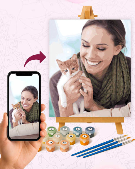
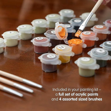
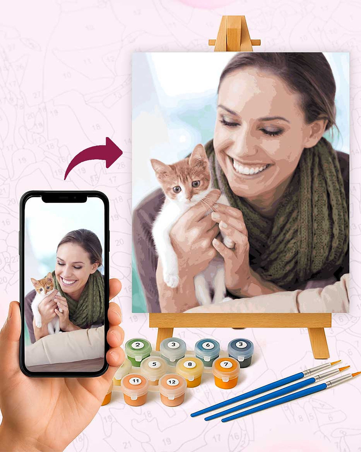
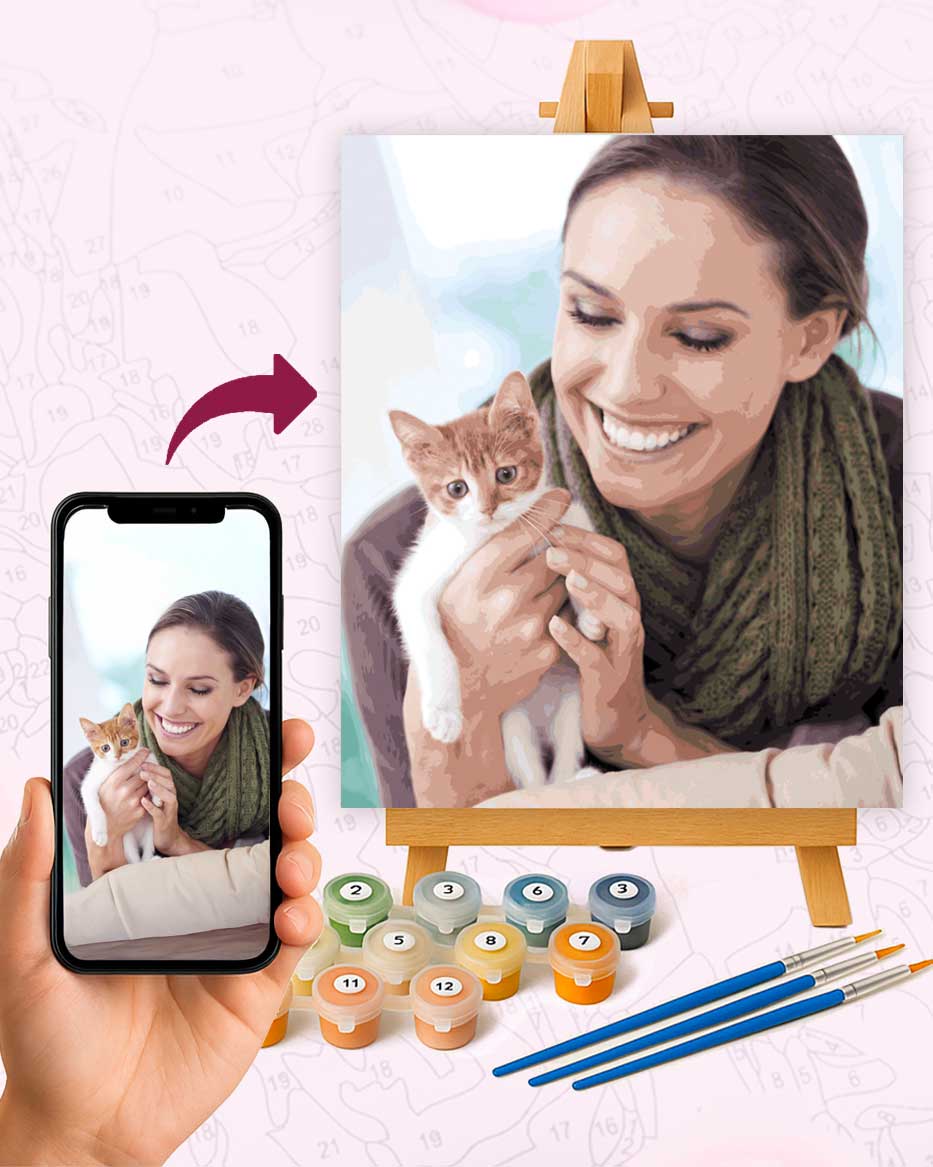
Turn one of your own photos into a numbered canvas (from $19.95). We trace it, mix the paints to match, and ship the kit with brushes.
Or pick a ready-made design
- Misty Forest Premium Paint by Numbers Kit for Adults (from $19.95)
- Swans in Golden Sunset - Premium Art Kit (from $19.95)
- Autumn Glow Premium Paint by Numbers Kit for Adults (from $19.95)
Examples of Analogous Colors
Any slice of neighboring hues on the 12-color wheel works. The groups painters use most:
- Yellow, yellow-orange, orange. The palette of late-afternoon light, wheat fields and candle flames.
- Red, red-orange, orange. Fire, autumn maples, desert rock.
- Yellow, yellow-green, green. Spring meadows and young leaves.
- Green, blue-green, blue. Sea water, pine forests, anything cool and quiet.
- Blue, blue-violet, violet. Dusk skies and deep shadow.
Notice that each group reads as one temperature. The first two lean warm, the last two cool, and that single shared temperature is what makes the combination feel settled.
What Is an Analogous Color Scheme?
An analogous color scheme is a palette built from one of those neighboring groups, nothing else. Designers and painters usually let one hue dominate, give the second a supporting role and keep the third as an accent. A common split is roughly 60 percent dominant, 30 percent support, 10 percent accent, so a forest scene might be mostly green, a third blue-green water, and a few touches of blue in the far hills.
The risk with an all-neighbor palette is flatness. Since there is no opposite hue to create contrast, you create it with value instead: very light and very dark versions of the same few hues. A pale yellow-green next to a deep forest green has plenty of punch even though the hues are two steps apart.
Analogous Colors in Famous Paintings
Claude Monet built most of his Water Lilies canvases on the cool half of the wheel: greens sliding into blue-greens, blues and violets, with the hue shifts doing the work that outlines would normally do. Van Gogh's sunflower still lifes from Arles are the warm mirror of that idea, yellows through yellow-orange into orange, with the background a slightly greener yellow than the petals. Turner's late seascapes often dissolve into yellow, gold and orange light with almost nothing else on the canvas.
None of these painters needed the full wheel in a single picture. Restricting the palette is the point: the narrower the band of hues, the more atmosphere the painting has.
Analogous vs. Complementary Colors
Complementary colors are the opposite pairing strategy, hues that face each other across the wheel like blue and orange. Complements produce maximum contrast and vibration; analogous groups produce harmony and mood. Many strong paintings use both at once, an analogous base plus one small complementary accent, which is covered in our color theory basics guide.
A quick way to decide: if the subject should feel loud, pick complements. If it should feel like weather, time of day or a single emotion, go analogous.
Painting with Analogous Colors
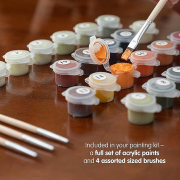
This is one scheme where paint by numbers quietly teaches you theory while you work. A kit with 24 to 48 numbered paints includes long runs of neighboring hues, six or eight greens shading toward blue, or a chain of yellows warming into orange, and as you fill the cells you watch an analogous scheme assemble itself. Landscape and sunset designs are almost always built this way.
If you paint freehand, three habits help. Pick your three neighbors before touching the canvas and keep every mix inside that band. Push the values further apart than feels natural, because hue alone will not separate the shapes. And if the result still looks too uniform, the fix is usually a tertiary color, one of the in-between mixes like teal or amber that sit between the main spokes of the wheel.
No experience needed. Money-back guarantee.
Free shipping to the US, Canada, the UK, the EU, Australia and New Zealand, with no minimum order. Buy two kits and the third is free, applied automatically at checkout.