











Color Theory Basics Every Paint by Numbers Artist Should Know
Color theory is the secret language behind why some paintings look stunning and others look flat. Understanding just a few basics transforms how you see and appreciate your paint by numbers work, and makes the experience richer.
At ArtistryByNumbers, our kits are designed with color theory built in. Free Worldwide Shipping and Buy 2 Get 1 Free.
Want to paint this yourself?
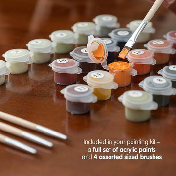
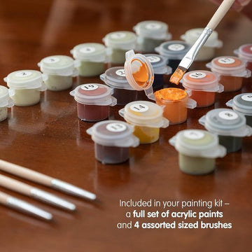
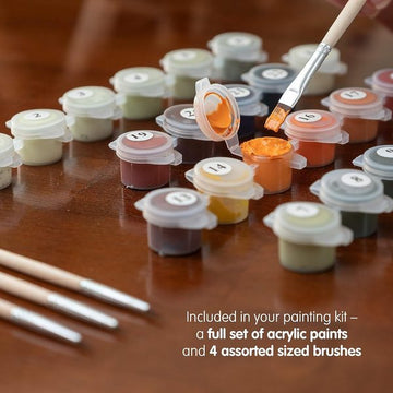
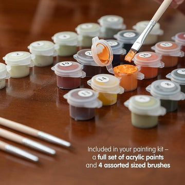
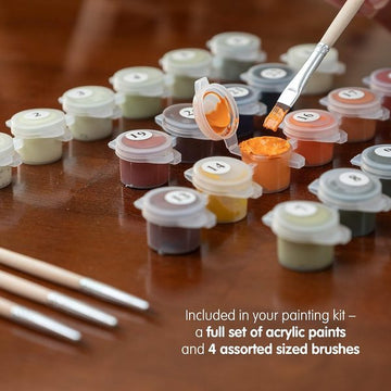
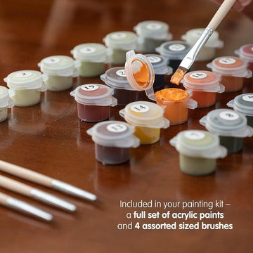
Turn one of your own photos into a numbered canvas (from $19.95). We trace it, mix the paints to match, and ship the kit with brushes.
Or pick a ready-made design
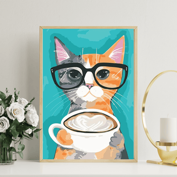
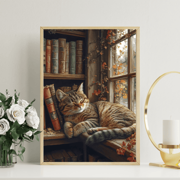
- Artist Cat Painting by Numbers Premium Kit (from $19.95)
- Perpetual Look Painting by Numbers Premium Kit (from $19.95)
- Bold and Free Painting by Numbers Premium Kit (from $19.95)
The Color Wheel
Every color relates to others on the color wheel. Understanding three relationships unlocks the magic
- Complementary (opposite on wheel), blue/orange, red/green, purple/yellow. These create maximum contrast and vibrance when placed next to each other. Notice how sunset paintings place warm oranges against cool blues.
- Analogous (neighbors on wheel), blue/blue-green/green. These create harmony and smoothness. Notice how forest paintings use greens flowing into blue-greens.
- Triadic (three equal points), creates balanced, vibrant compositions.
Warm vs Cool Colors
- Warm (red, orange, yellow), advance toward you, feel energetic and inviting
- Cool (blue, green, purple), recede, feel calm and spacious
In landscapes, warm colors dominate the foreground and cool colors create distant background depth. This is why our 36+ color kits include multiple warm and cool variations. They create the illusion of depth.
Value (Light and Dark)
Value is how light or dark a color is. High contrast (very light next to very dark) creates drama and focal points. Low contrast (similar values) creates subtle, atmospheric effects. Our kits use value strategically, the subject is usually high-contrast while backgrounds are lower contrast.
Why This Matters for PBN
You do not need to memorize color theory to enjoy paint by numbers, our kits do the hard work for you. But understanding these basics helps you appreciate WHY the painting looks good, and gives you confidence to customize or try freehand painting later.
No experience needed. Joined by thousands of painters worldwide. Money-back guarantee.
👉 Shop Kits | Custom Kit
Free Worldwide Shipping • Buy 2 Get 1 Free