


The first Venice kit I finished sat on my kitchen wall for two years before anyone believed I painted it. That is the trick with this city. The buildings lean, the water throws back a wobbly copy of everything above it, and the light goes gold about an hour before sunset. Get those three things roughly right and the canvas does the rest.
Venice scenes fall squarely in the middle of the difficulty scale. Not a beginner's first pick, but nowhere near the hardest thing in a cityscape collection. Most kits land at 40x50cm with somewhere between 28 and 36 colors. The color count matters more than the size here, because Venetian water is never one flat teal. You will see three or four greens blending into a muddy brown near the walls, and a kit that gives you all of them saves you from muddying your own.
Why the water is the whole painting
Roughly the bottom third of a canal scene is reflection. Beginners rush it and end up with a swimming pool. Slow down. The reflections should be a slightly darker, slightly grayer version of the buildings directly above them, and the edges should be soft. I paint the water last, after the buildings are dry, so I can glance up and copy what is actually there. Horizontal brushstrokes only. A few short pale streaks near the gondolas suggest ripples without you having to paint every wave.
If your kit uses acrylics that dry fast (most do), keep a damp paper towel over your palette wells. The greens are the ones you will keep going back to, and there is nothing worse than a skinned-over pot halfway through the water. Our guide on smooth blending covers the wet-on-wet trick that makes canal reflections look painted rather than colored in.
Architecture without the panic
Those tall shuttered facades scare people. They shouldn't. Venetian buildings are forgiving because they are meant to look old and slightly crooked. Paint the large wall shapes first with a flat brush, then switch to a small round (a 00 or a 0) for the window frames and the little iron balconies. Keep the frames a shade darker than the wall and your eye reads depth automatically.
One warning. The perspective lines all run toward a vanishing point somewhere down the canal. The number regions already respect this, so resist the urge to "fix" a line that looks off. It looks off because that is how a receding street looks. Trust the print.
The gold hour glow
The best Venice kits are painted at that warm, low sun. You get peach on the plaster, deep blue-violet in the shadows, and a sky that shifts from pale yellow near the horizon up to soft blue. When you hit the sky, work fast while the paint is wet so the yellow melts into the blue with no hard seam. A dry flat brush dragged lightly across the join blends it in seconds.
Time-wise, budget around 14 to 20 hours spread over a couple of weeks. It is not a weekend project unless you have a very free weekend and a strong wrist. I usually do two-hour sessions, water last, and I never try to finish the whole canal in one sitting because tired hands wobble.
Where Venice fits with the rest
If canals hook you, the same skills carry straight into other water-heavy scenes. A Santorini or coastal kit from our seascape range uses the exact reflection technique, just with bluer water and whitewashed walls. And if you like the romance of European streets, the Paris cityscape kits pair beautifully with a Venice piece on the same wall.
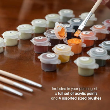
The supplies that actually matter here
Your kit brushes are fine for the big wall shapes, but Venice punishes a frayed tip on the fine iron balconies and window mullions. If you paint a lot, a cheap set with a proper 00 round is a worthwhile few dollars. Keep two water jars, one for rinsing and one clean for thinning, because the greens and browns will silt up your rinse water fast and you do not want that murk creeping into your creams. A small spritz bottle to mist your acrylic wells keeps the many blues and greens workable through a long session. None of this is required. It just makes the water go smoother, literally.
A quick word on the sky-to-water balance
People fixate on the buildings and forget that a canal scene is really sky on top, buildings in the middle, and a mirror of both at the bottom. Step back every twenty minutes or so and check that the reflection is reading as a softer echo, not a hard copy. If it looks too sharp, drag a barely-damp flat brush horizontally across it while the paint still has some give. That single move fixes most stiff-looking canals.
Ready to start? Browse the cities collection and look for a Venice scene shot at sunset rather than midday. The warm-light versions are more satisfying to paint and, honestly, they sell your wall a little dream every time you walk past.