


Poppies are loud. A field of them is basically a red siren going off in a green meadow, and that is exactly why they make such satisfying paint by numbers subjects. The color does the heavy lifting. Your job is mostly to not muddy it.
I painted my first poppy field on a rainy Saturday and finished the whole thing in two sittings. Compared to a rose, a poppy is refreshingly simple. Fewer petals, bolder shapes, and a design that forgives a slightly shaky hand.
Why poppies are beginner gold
A poppy petal is a big, open cup. There is not much fussy overlap, and the number zones tend to be generous. That makes poppy kits some of the friendliest florals for a first project. If you are shopping for someone brand new to the hobby, poppies belong on the shortlist right next to daisies. The whole beginner-friendly collection leans on shapes like this for a reason.
Most poppy kits carry 24 to 30 colors. That is fewer than a rose, which tracks, because a poppy is a study in three or four strong reds plus the greens of the field and that famous black heart.
The red is a trap, sort of
Here is where people go wrong. They paint all the reds first because red is the fun part, and the flower ends up looking like a flat sticker. The fix is the same as with any petal work: get your darkest tone down first. Poppies have deep crimson shadows where the petals meet the center. Lay those in, then the bright scarlet, then the orange-red highlights on the curled edges last.
That layering order keeps the reds clean and gives the petals a cupped, three-dimensional look instead of a paper cutout. If coverage is giving you trouble, red is notorious for needing two coats over a dark canvas, the walk-through on layering paint for better coverage will save you some frustration.
The black center makes or breaks it
A poppy without a proper inky center looks unfinished. Paint the black heart carefully, with a small brush, and don't rush the edge where it meets the red. That crisp boundary is what your eye reads as depth. Some kits even ask for a tiny ring of dark purple or blue between the black and the red. Do not skip it. That thin ring is the difference between flat and glowing.
Let the red dry completely before you touch the black. Acrylic black over wet red will bleed into a muddy brown, and there is no rescuing that gracefully.
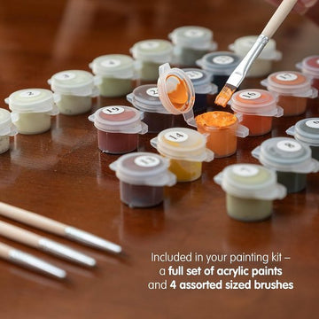
One more thing about brushes. Poppies reward a slightly bigger flat brush than you might reach for on a detailed kit. The petals are wide and open, so a broad brush lays the red down in fewer, smoother passes, which keeps the color even instead of streaky. Save the tiny detail brush for the black center and the thin grass blades. Switching brushes for the right job sounds obvious, but it is the single biggest upgrade to how clean a poppy field looks when it dries.
Field scenes vs single blooms
You have two roads. A single large poppy is bold, modern, and quick, maybe 6 to 10 hours on a 40x50cm canvas. A full poppy field is more romantic and takes longer, closer to 12 to 16 hours, because all those tiny background blooms and grass blades add up. Both look great framed. The field version pairs beautifully with the softer palettes you find in the spring flowers guide, if you are decorating a whole wall around a season.
Where a finished poppy belongs
Red is a warm, energizing color, so a poppy canvas does its best work in rooms that want a bit of life. A kitchen, a home office, an entryway. It is a little bold for a bedroom, in my opinion, though a muted field scene can work.
Poppies also make an easy, cheerful gift because almost everyone likes them and nobody is precious about them the way they might be about, say, a portrait. Bundle one into the gift kits range and you have a present that looks thoughtful and costs about what a nice bunch of flowers would, except this one lasts.
Grab a poppy from the floral and botanical collection and give yourself a weekend. It is the most immediate hit of color-satisfaction the hobby offers, and if red hooks you, the rest of the flowers are right there waiting.